 If you don’t think fonts matter, take a look at the article in Friday’s New York Times. Errol Morris describes the informal experiment of a university student who found that he could raise his grade average just by doing one thing: changing his essay font.
“[The student] had written 52 essays in total. Eleven were set in Times New Roman, 18 in Trebuchet MS, and the remaining 23 in Georgia. The Times New Roman papers earned an average grade of A-, but the Trebuchet papers could only muster a B-. And the Georgia essays? A solid A.”
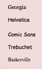
Intrigued, Morris created his own experiment. He tested 45,000 readers’ perceptions of the “truth” of a passage when presented in one of six randomly assigned fonts–Baskerville, Computer Modern, Georgia, Helvetica, Comic Sans and Trebuchet.
Turns out, if you want your writing to emit an aura of truthiness, Baskerville is your font. Who knew?

Intriguing. I’m assuming the experiment was limited to paper. I’d be interested to know how the test translates to the web. For my blog, which is science/medicine-heavy, I use (by default) Trebuchet. I think Helvetica would convey a similar serious/truthful/clean tone. Georgia and Baskerville seem just a little too textbook-y for the web. And Comic Sans? If you’ve just got to use it, save it for PowerPoint.